

Just because you are dead serious about growing your e-commerce business, doesn’t mean everything you’re doing is good for your online store.
The fact is, you might very well be doing something right this very moment that’s hurting your conversion rates.
If you want to ascertain (to some extent), that your strategies are going to yield good results, at the very least, you need to base your strategies on e-commerce data and statistics that are relevant to your industry.
You also need to track your results to determine which among your marketing methods are working and which ones aren’t.
To help you avoid shooting yourself in the foot by doing something that will harm your e-commerce business, allow me to share with you four of the most common mistakes that e-commerce business owners are doing that’s hurting their website conversions (unknowingly).
Let’s hop right in.
1. Not getting customer feedback.
If you’re not asking your customers what they think and feel about your brand, products, and website, then you’re missing out on useful data to improve your audiences’ user experience.
Remember that your marketing efforts should focus primarily on your customers. You need to address their needs and their wants so you can provide real value.
This means that if you’re oblivious about your potential customers’ wants, you could be wasting time, effort, and money on creating marketing campaigns that offer zero value to your audience.
You can ask for feedback from your customers after they checkout, view your product page, or once they’ve used your products.
Using exit popups is also an excellent way to obtain feedback from your customers.
With tools like JotForm, you can create your customer feedback form.
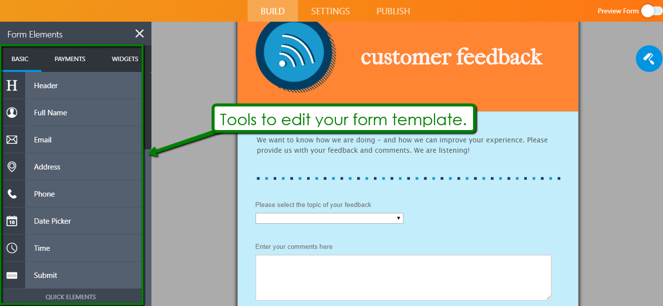
The tool lets you choose from customizable templates that you can modify to your liking and select how you want to publish your form, like embedding your feedback form to your e-commerce website.
Directly asking your customers for their feedback will help you refine your marketing campaigns and improve your customer satisfaction — this, of course, will ultimately bring you better conversions.
2. Not having a guest checkout option on your e-commerce website.
If your target audience is like most people that are using the internet, then they’re also most likely on the go.
With how fast-paced life has become for most people, you can’t afford to slow down your site visitors from buying from you by asking them bazillions of information before they can complete their purchase. If you do that, there’s a good chance they’ll only click away.
I get it, there are tons of benefits to be had from having your customers register on your e-commerce website, however, requiring them to register first before they can even make a purchase can easily ruin their buying experience.
That’s why you need to have a “Guest Checkout” option on your site.
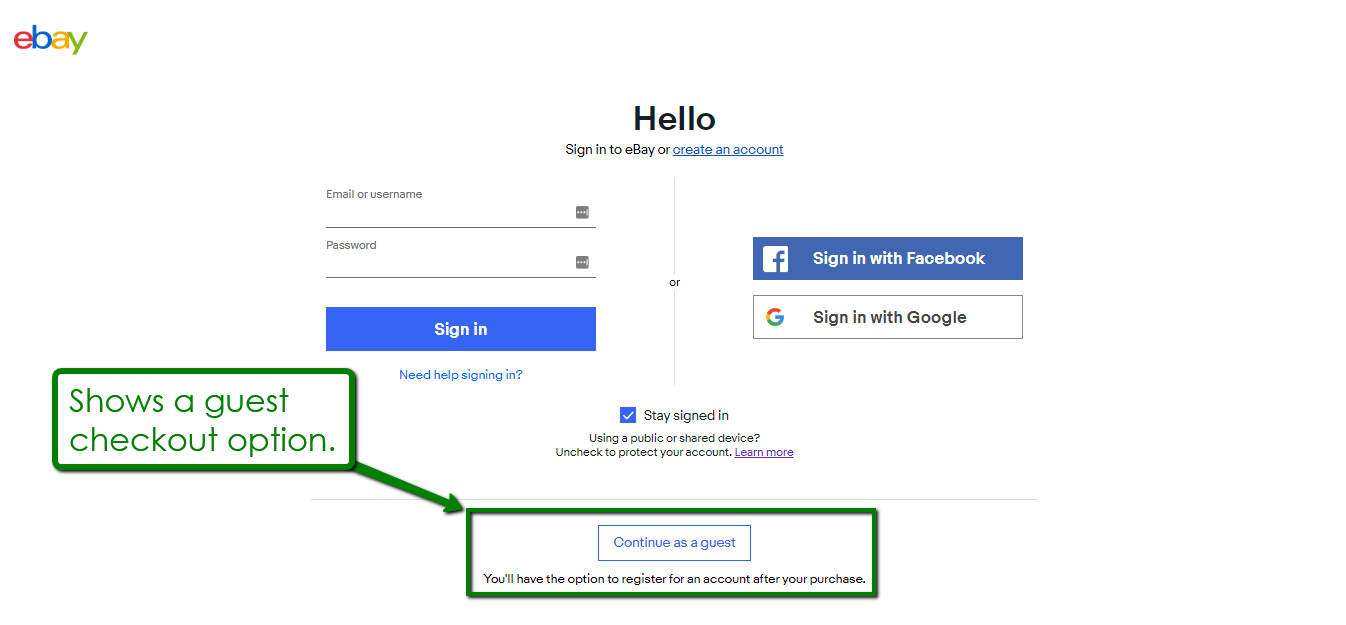
Image Source: eBay
Instead of asking your website visitors to sign up, you can ask for the necessary details only to complete the purchase, such as your customers’ mailing address, payment information, etc.
You can always ask your customers to register later. The key is to let your customers complete their purchase first so you won’t lose the sale. Once they’re done with their purchase, that’s when you can ask them to register, make additional purchases, or even share your products, among other things.
3. Unclear value proposition and on-site messaging.
Can you imagine clicking on a Google ad for mountain climbing gears only to land on a website that only sells tents?
That’s straight-up confusing, don’t you think?
If your ad is about “mountain climbing gears,” then you ought to show mountain climbing gears and not just tents on your landing page.
Doing otherwise will only confuse your audience.
That’s what happens if your value proposition and on-site messaging are unclear.
If your customers click on your ad, your landing page needs to align perfectly with what your ad is all about, otherwise, your audience will most likely click away.
To keep your audience from getting confused, thus, causing them to click away, here are some points that you can consider:
- Be clear about your products and services.
Tell your customers about the products you’re selling and what you do by displaying attention-grabbing but relevant taglines, messaging, images, and more.
Also, you can get as creative as you want with your value proposition. Just make sure that you don’t compromise the clarity of your message.
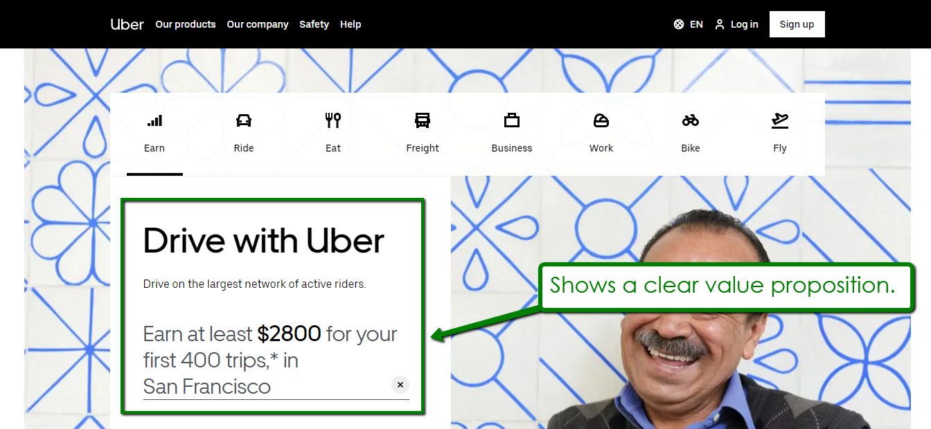
Image Source: Uber
- Show your customers the next step. After getting the attention of your target market with your value proposition, you’ll need to show them the next step.
Do you want your potential customers to keep navigating through your site, see your latest discounts, or click on your CTA buttons?
4. Weak Call-to-Actions.
How you design your CTA buttons can have a significant impact on your conversions.
Why?
Because even a single element — such as the color of your CTA buttons — can subconsciously either compel your website visitors to click on your “Buy Now” button, delay the purchase, or leave your site entirely.
This can hurt your conversion rates, so you’ll need to assess if your CTAs are compelling enough to drive customers to complete your conversion goals.
Here are a few other reasons why your CTA buttons might not be effective and how you can fix them.
- The copy is too short. Using concise text will always have its benefits, but a single “Purchase” or “Subscribe” doesn’t really explain what happens when a customer clicks on your CTA buttons.
If you’re offering a free ebook about “The Web’s Most Searched Questions About Dropshipping,” for users who register for your webinar, for example, then you can use “Register to Get Your Free Ebook Now” instead of just “Register.”
- Your CTA doesn’t stand out. A compelling CTA is one that pops out from its background, which makes it crucial for you to use the right combination of colors, typography, and contrast.
Also, ensure that your CTA blends with your page aesthetics, content, and message.
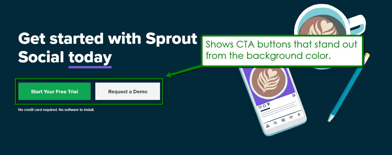
Image Source: SproutSocial
- There is no context to your CTAs. If your CTA isn’t relevant to your page content, you’ll only end up confusing your site visitors.
Your content and CTA should work together to capture audience interest, and you can’t do that if your call-to-actions content is disconnected.
For instance, if you publish a blog about traveling tips, adding a “Sign Up to Get Your Free Ebook on Data Science” doesn’t make sense and won’t do much for your conversions.
What’s Next?
Make no mistake, we’re just scratching the surface with the points I shared in the article.
There are countless other ways an e-commerce entrepreneur can mess up their conversion rates even without them knowing it.
Was there ever a time when you did something that wrecked your conversion rates? If you answered with a “yes,” then take the time to share your story in the comments section below. The more you share, the more our readers can learn.


